 Readers,
I’d love to get your input on three recently redesigned book covers for my new devotional. Some clicking is required as each link opens a separate file. Or you can just look at the picture above.
Just review all three and comment below as to your favorite. THANKS SO MUCH!
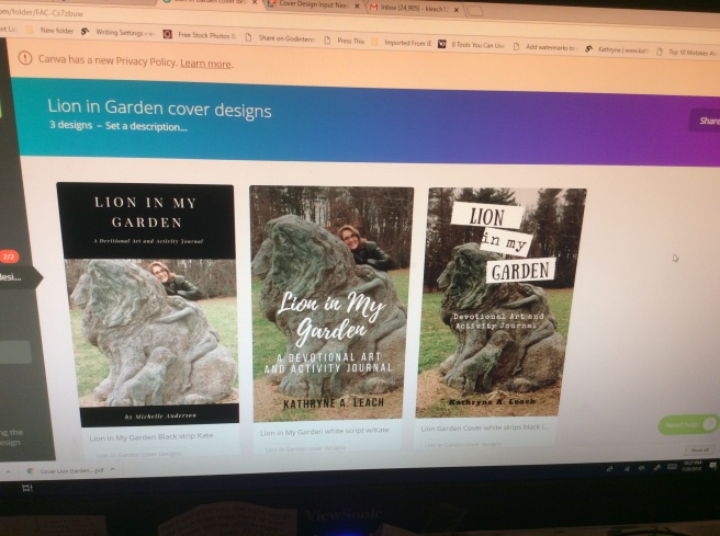
#1 has third of cover in black, white lettering and author near statue
2. Copy of Lion in My Garden PDF cover Canva
#2 has title in white script and author image with lion statue
3. Lion Garden cover statue only Black letter on white strips
#3 has on white strips, black lettering and no author image
Categories: Devotionals My Books Writing
Kathryne
Christian author and truth teller whose words make darkness tremble. Author of two non-fiction books at https://www.instagram.com/tattooedking_book/

#2 Definitely. It is much more pleasant to the eye with you in the picture as well as the script.
LikeLiked by 1 person
Thanks!
LikeLike
Number 2 is the best of the three. Is there more room at the bottom of the photo in order to push the photo up? This would push the lion and you higher in the frame and give your name more room “ in the hay”. Doing that would make your name more visible and readable.
LikeLiked by 1 person
Thanks, Jeff. No more room in the inn … LOL. But I can increase font size on my name. Great idea!
LikeLike
Hello Kate they are all wonderful! My eye really is drawn to number 2 I can’t wait to read it. I’m in Melbourne hope to see you soon.
LikeLiked by 1 person
I think it depends on what you are looking for. My immediate reaction was #1, because it had a professional look to it. I agree with the two people above that #3 is probably not the strongest. God bless as you work out this exciting part of the book God gave you.
LikeLiked by 1 person
I appreciate your thoughts. You’re the 2nd person who said #1 looked professional. Am thinking of swapping the image in #1 with the darker photo.
LikeLiked by 1 person
Hi Kate, I luke #2 the best. The photo introduces you in a playful, friendly way. The cover writing and font are pleasing aesthetically and it is clear what type if book it is. When looking at thr cover I am intrigued to find out what is inside, how it is laid out and how I this is different from devotionals I used before. Love you, Sister!
LikeLiked by 1 person
That is extremely helpful feedback, friend. I love that it intrigues you (the whole point). Seems cover #2 is the favorite and leader so far. 👍😍
LikeLike
I like #2! Easiest to read!!!!
Katie
LikeLiked by 1 person
Thanks for weighing in, Katie! Number 2 is the favorite so far.
LikeLike
Hi Kate
I liked #1 best. Somehow it drew me in to pick it up. Carol
LikeLiked by 1 person
I guess I’m the odd one out, because I actually like #3 as my number 1 choice. I do like #2 as well.
LikeLiked by 1 person
Thanks Tiffany. This is a hard decision so plz pray for me. 💕
LikeLike
#2 sticks out to me the most with the scenery in the background
LikeLiked by 1 person